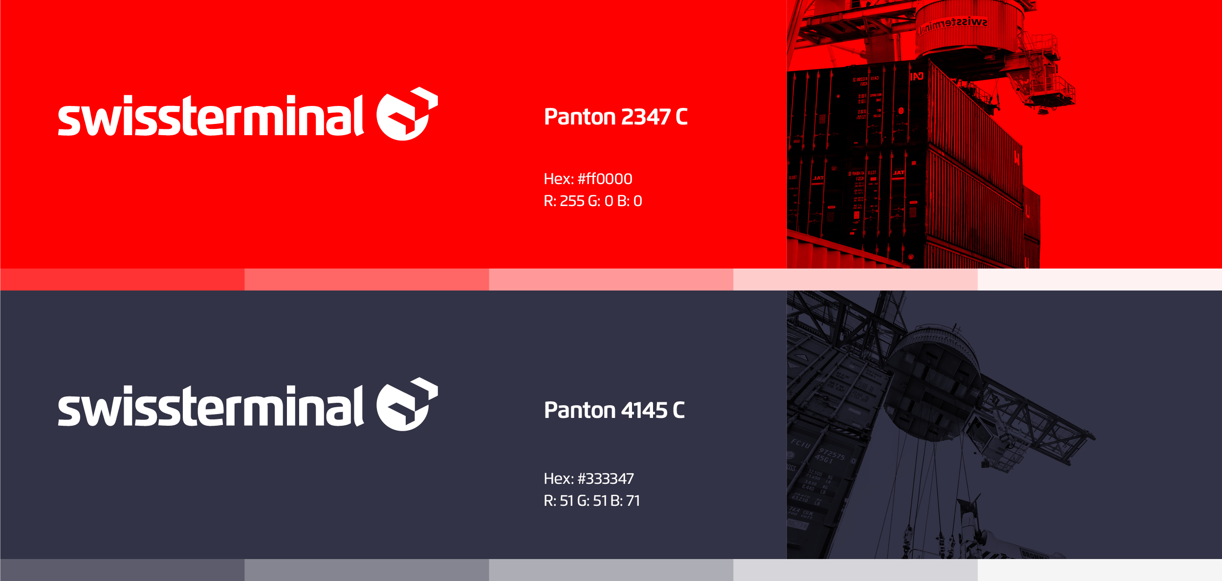
Swissterminal
This 360° Rebranding campaign for a swisserland based logistic company is a combination of innovation and tradition. Inspired by the container shapes and the traditional swiss design, we created a red and blue brand with colour-blocked imagery. The logo, buit from an hand drown logotype shows this combination of structure and playfulness.